The latest version, WordPress 5.3 is just released this week. This release is big, because it includes the latest updates to the block editor, Gutenberg and features the brand new Twenty Twenty theme.
WordPress has come a long way since its 5.0 release with the new block editor, Gutenberg. While there were a ton of controversy on the new editor, more people adopted to the new editor and latest WordPress releases over the past 10 months.
Our plugin and theme is also updated to better support this latest WordPress release.
This release is a major one and brings many exciting features. Let’s find out what they are:
Block Editor in WordPress 5.3
As some of you know, WordPress uses the Gutenberg plugin in the core. While the updates for the plugin continues in the repo, team includes a slightly earlier version in the WordPress core with each release. With this WordPress release, the editor is now using the Gutenberg plugin version 6.6 with some fixes are from version 6.8 (Gutenberg 6.9 release is also happening week).
This enhancement-focused update introduces over 150 new features and usability improvements, including improved large image support for uploading non-optimized, high-resolution pictures taken from your smartphone or other high-quality cameras.
The editor is also now much faster in term of performance, compared to the earlier versions of WordPress and Gutenberg.
| Version | Loading Time | KeyPress event (typing) |
|---|---|---|
| Gutenberg 6.6.0 | 4.7s | 38.96ms |
| Gutenberg 6.5.0 | 4.68s | 42.96ms |
| WordPress 5.2 | 5.69s | 57.65ms |
Apart from performance, the block editor gains a couple nifty features with the latest WordPress release:
Group Block
The group block is a wrapper to contain other blocks in the editor. The benefits of this block can be assigning a wide or full aligned layout. And adding a custom background color is also available. This is useful when a block inside the group has no option to add it.
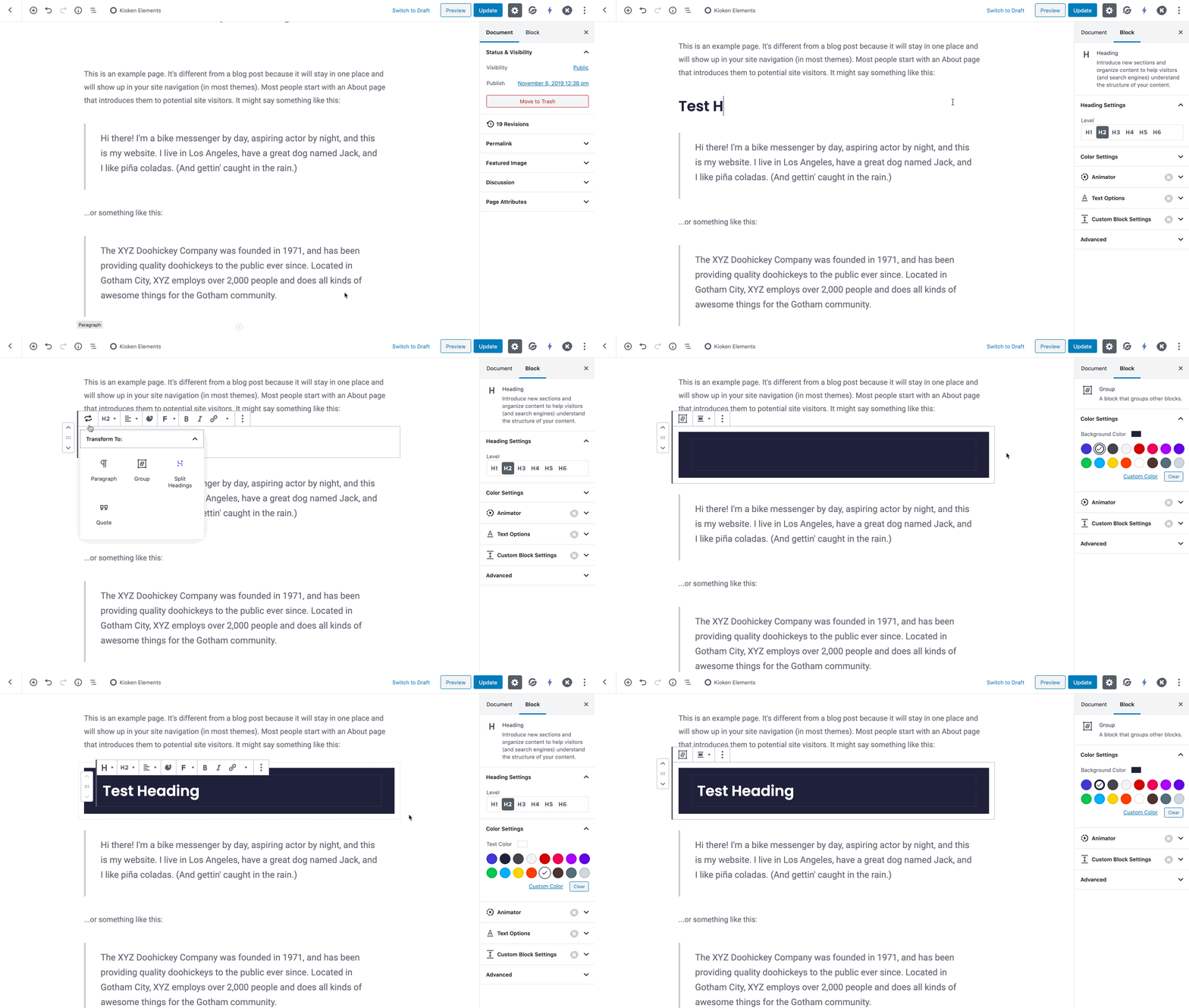
You can also create a Group blocks by ‘group’ interaction.
This allows you select multiple blocks and group them with only a few clicks. You just need to select multiple blocks, and then click on Group in the ellipsis menu.
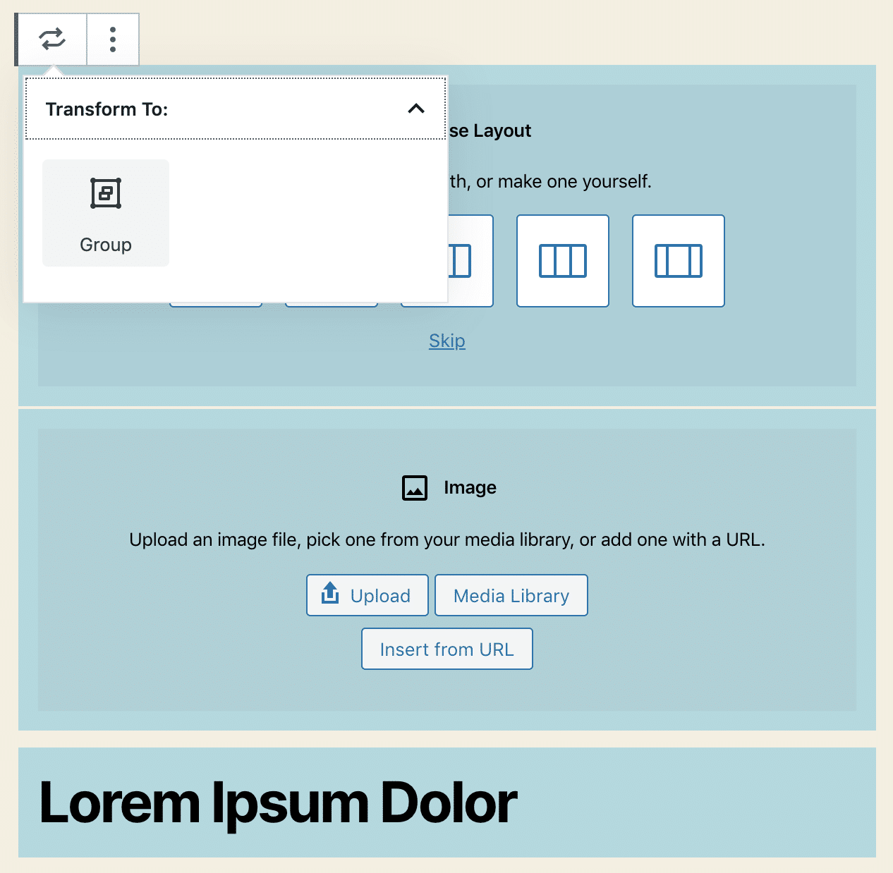
New Block Appender in WordPress
The Group and Columns blocks now show a block appender on empty state. The appender is just a grey area with a plus sign inside that makes the UI clearer and improves the block usability.
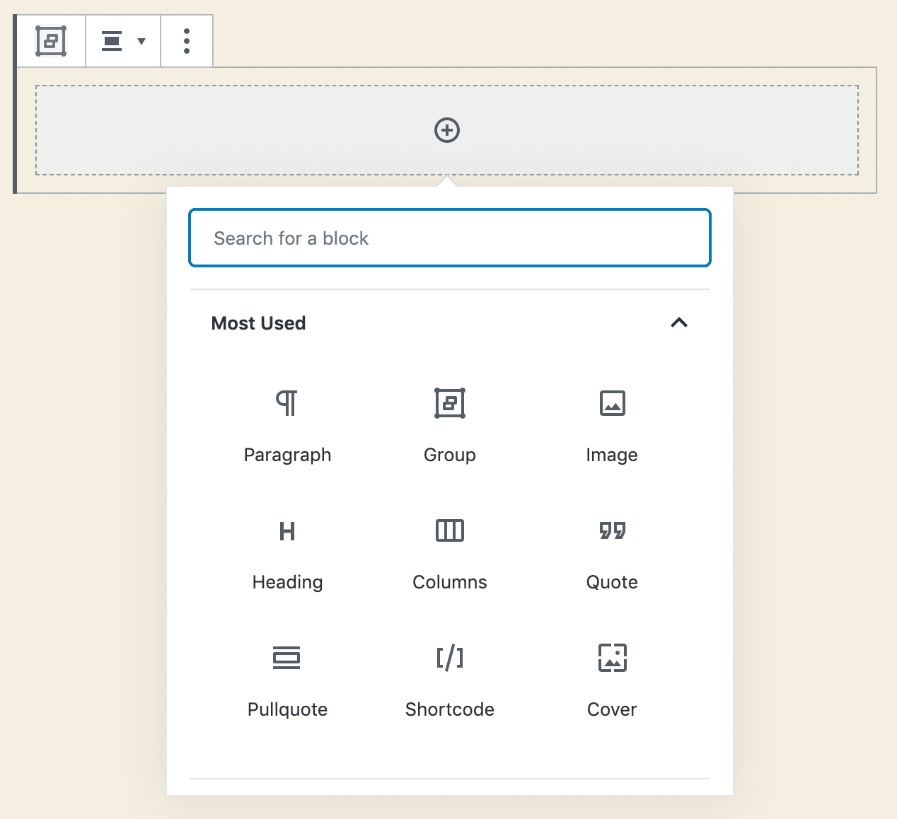
Columns Block Updates in WordPress 5.3
While Kioken Blocks has a much more advanced Container Row block, the columns block inside the WordPress editor core has always been a good layout building tool. With the WordPress 5.3 release, the columns block is much more improved.
Layout Picker for Columns
Added to the editor with Gutenberg 6.0, this feature in columns block allows users to choose from several pre-defined layouts (patterns) or skip to the default layout, speeding up a bit the editing process and making the block easier to use for less tech-savvy users.
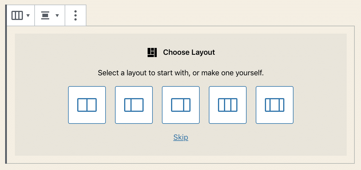
The layout picker is a feature of the Block Patterns API which provides a way to choose between a predefined set of options to pick from when adding a block. Aside from the Columns block, you can see examples of Block patterns in Table and Cover blocks. You can read more about the Block Patterns API on GitHub.
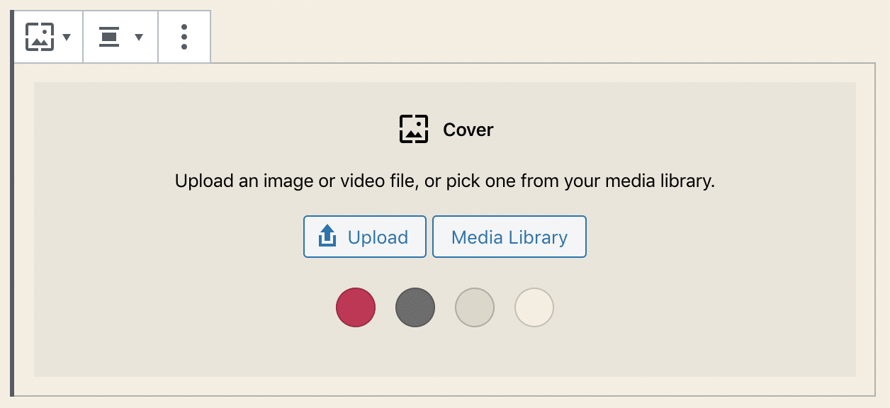
Custom Width options for Columns
The columns block now also supports a sliding control in Block settings enabling you to define a custom width for each column (in a future release, we may expect further improvements to the Columns block with the introduction of a draggable resize control).
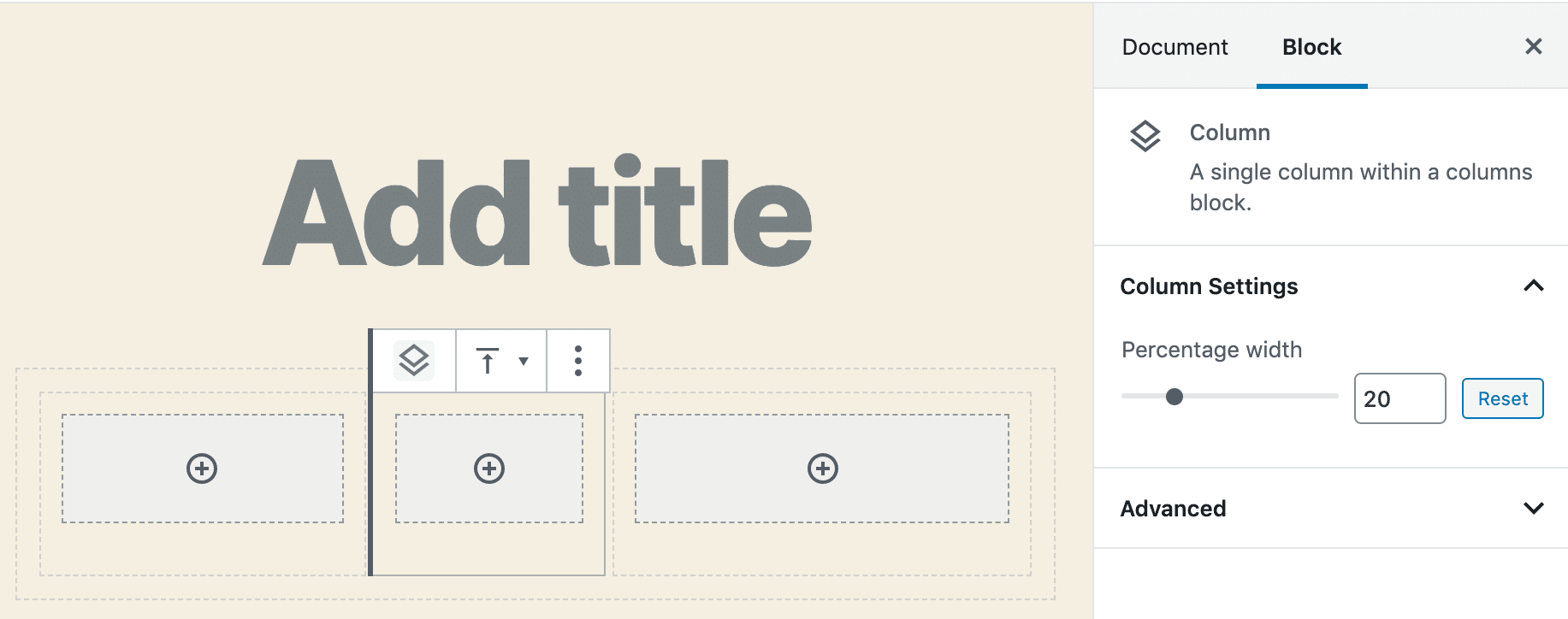
Improved Table Block
The Table block received several new features. It now supports text alignments in columns, table header and footer, and background colors.
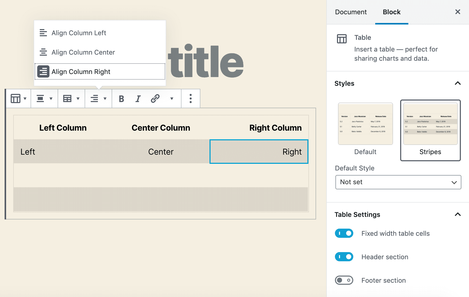
Accessibility Improvements with Navigation Mode
Gutenberg 6.3 introduced the Navigation Mode to navigate between blocks using Tab or arrow keys without going into block content. Users can switch from Navigation Mode to Edit Mode and back just by hitting Enter or Esc. This feature is a great improvement in usability, especially when it comes to screen readers.
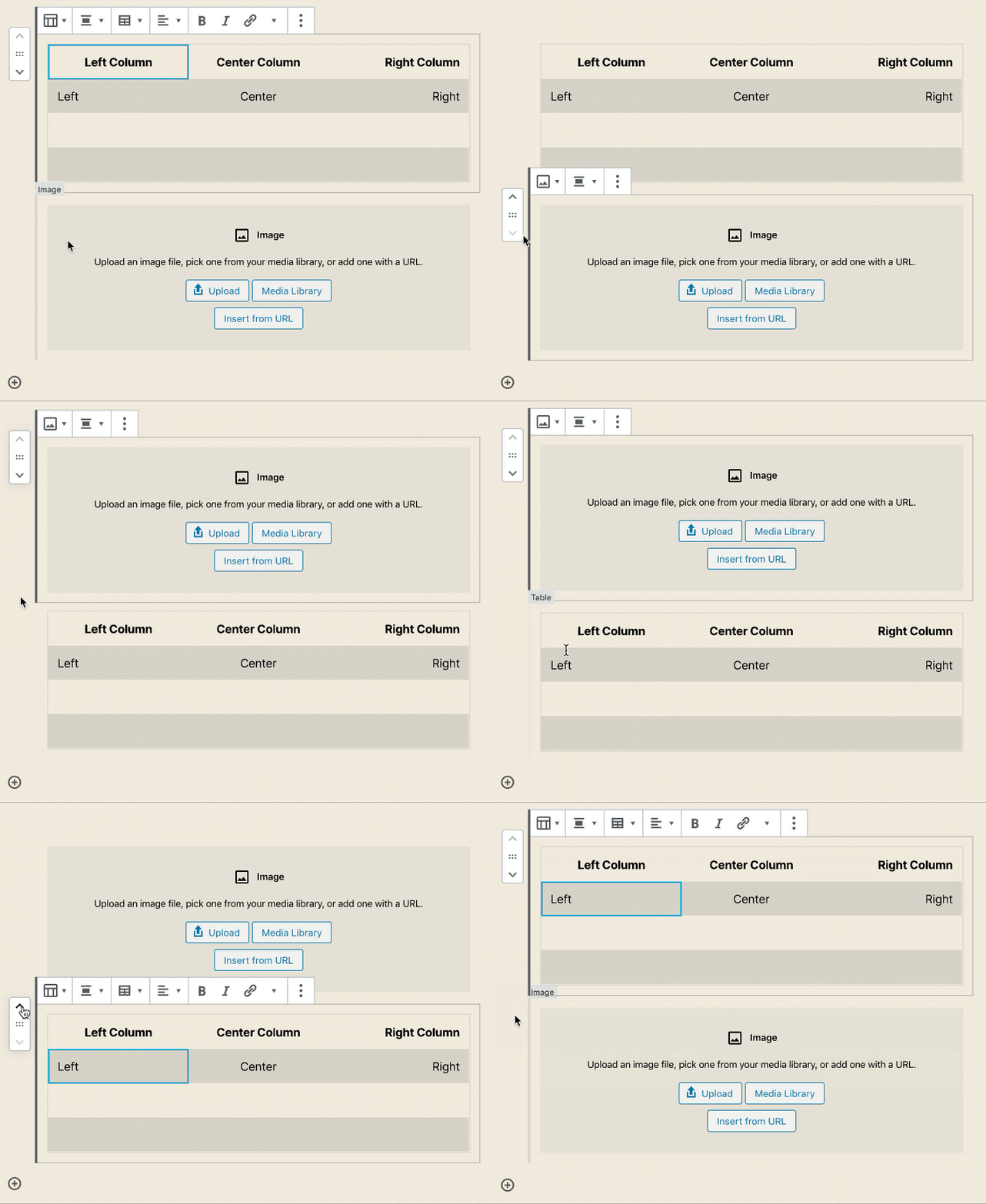
Motion effect while moving blocks
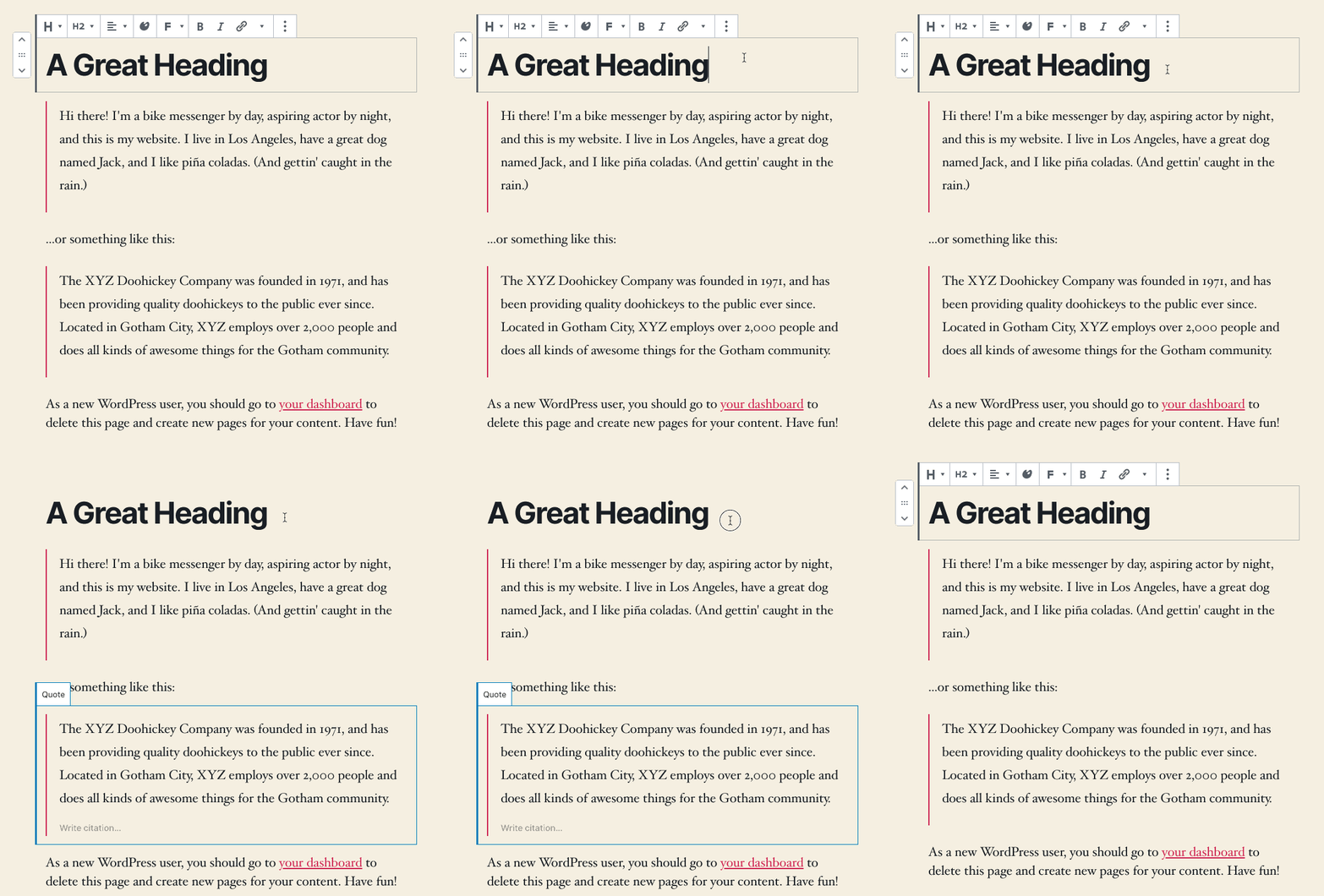
An additional improvement in usability comes with the introduction of motion to block changes, creation, removal, and reordering. Matías Ventura explains why this feature is relevant:
Consider the case of a list containing a set of items:
the action of moving, reordering, and so on, doesn’t just affect the single item being acted on but the rest of the set as well, particularly the one it is “swapping places” with. Reality conveys to us that in order to put something in the place of something else both things have to move. The change in overall state for the entire group can be harder to grasp by just changing the order instantly. It takes a moment to reorient. Transitions and gesture based interactions generally help connect these two states in a way that makes the interaction (the “what just happened”) more immediately understandable.
Matias Ventura
Contextual Reordering in Gallery Blocks
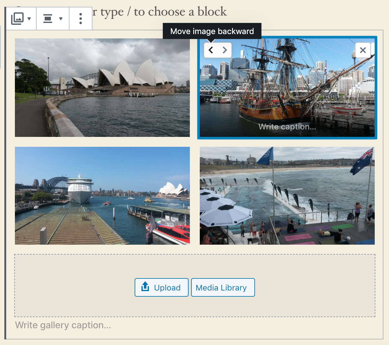
The Gallery block has been enhanced with inline image reordering. We can now rearrange images in the gallery with a simple click on Move image forward and Move image backward buttons without opening the media modal screen.
Admin Experience Enhancements
Besides Site Health Tool, WordPress 5.3 brings several Admin UI enhancements that should considerably improve the overall experience of the whole WordPress dashboard.
1. Better Color Contrast
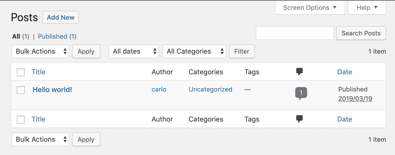
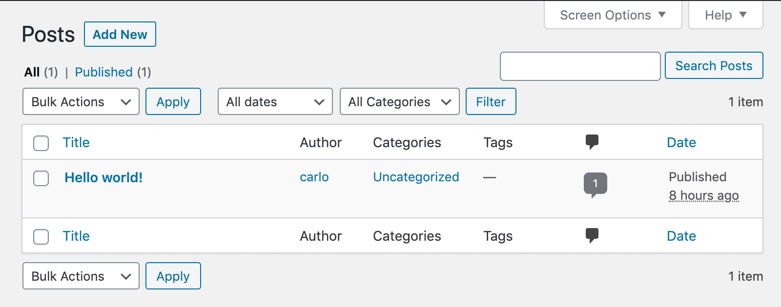
The color contrast has been increased and many accessibility issues have been fixed.
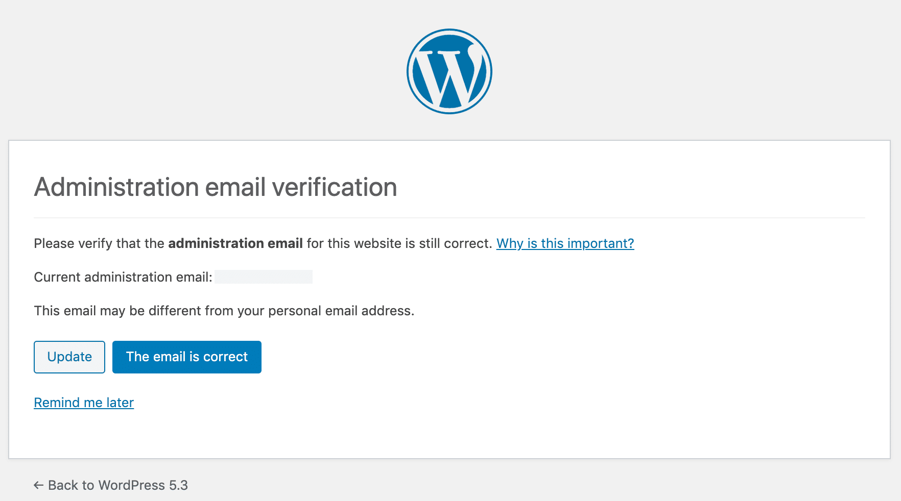
2. Admin Email Verification
An admin email verification now triggers after an admin hasn’t logged in a period of time. By default, this interval is set to six months, but developers can set a different interval using the admin_email_check_interval filter (see tickets #46349 and #48144).
3. Resumable Uploads
Uploading big images from a smartphone won’t break things in the middle of the process as WordPress now supports resuming uploads when they fail.
4. Image Rotation
Images are now correctly rotated on upload according to EXIF orientation metadata.
A Brand New Default Theme: Twenty Twenty
WordPress 5.3 comes with a brand new default theme: Twenty Twenty. It’s a minimal theme designed for flexibility, clarity, and readability, with a keen focus on the Block Editor.

Twenty Twenty has been built upon an existing free theme from the community, Chaplin by Andérs Noren, and features a free and open source typeface with strong personality: Inter by Rasmus Andersson.
You can also check out the live site of the Twenty Twenty theme in action at http://2020.wordpress.net/
You can read more about Twenty Twenty in our in-depth blog post: Twenty Twenty: An Introduction to the New Default WordPress Theme.
Under The Hood Improvements in WordPress 5.3
WordPress 5.3 brings many improvements for developers. Following are some of those under the hood changes. WordPress 5.3 will offer a better way to discourage search engines from indexing a website when you check the option ‘Discourage search engines from indexing this website’ option. (#43590)
The upcoming release will also improve WordPress compatability with PHP 7.4. (#47441, #47704, #47746, #47746, #47783)
WordPress 5.3 will come with improved handling of date and timezone functionality, which will allow developers to use them more efficiently in their projects. (See details)
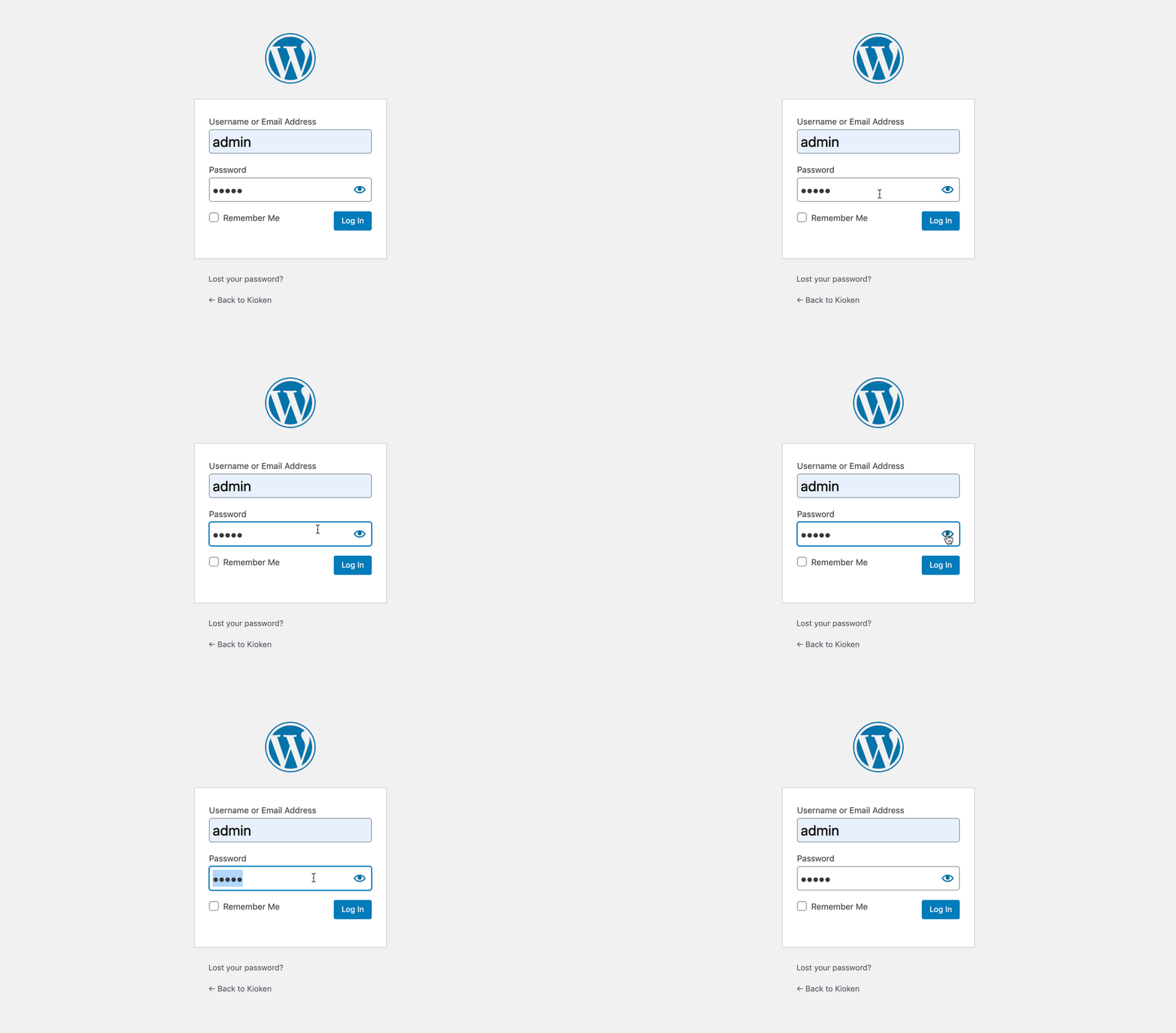
A show/hide password toggle will now be available on WordPress login screens on both mobile and desktop devices. (#42888)
Conclusion
WordPress 5.3 brings a ton of features and might just be the biggest and best release in 2019. We believe it will be a favorable release among all WordPress versions to this day. The block editor improvements are too good to miss and we encourage you to upgrade to 5.3 for a better editing experience and performance.
With thirteen versions of the Gutenberg plugin merged into core, several improvements to the Site Health Tool, a brand new default theme, improvements in the admin interface, new functions and features for developers and theme designers, better support for PHP 7.4, and an incredible number of small changes, bug fixes, and deprecations, WordPress 5.3 sets an important milestone in the evolution of the CMS.
What are your favorite features/improvements? Did we miss anything important? Share your thoughts with us in the comments section.

Great article and very ckear writing.