If you have been using Kioken Blocks in Gutenberg, you might have realized how powerful some of the blocks. Container Row, Features block and Kinetic Wrapper for instance, allow you create advanced structures. Today we will have a look at our possibilities with one of our blocks, Features.
Vertically offset Features

As you can also see on our website, we have some feature boxes that are aligned vertically uneven. It’s way too easy to achieve that with changing a few settings on a feature. Lets start with inserting features.
If you have become familiar with Gutenberg’s shortcuts, adding a new block in a new line is very easy. Just press the slash “/” key after hitting enter and start typing:

Clicking on the “Features” block in the list or hitting enter as soon as you see the block is outlined in the list will insert a new Features block in the editor. Just like the following one (we increased the columns number to 3, instead of 2):
A Great Feature
Change this paragraph with your awesome feature content!
A Great Feature
Change this paragraph with your awesome feature content!
A Great Feature
Change this paragraph with your awesome feature content!
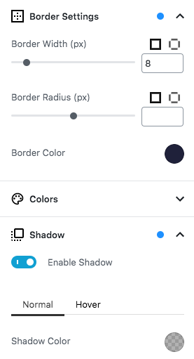
Now lets click on the second feature and edit some settings. Lets add a a border and shadow. After we applied these settings to the feature in the middle, it will start looking even fancier.
And finally, lets open up the Override Spacings panel for the feature in the middle and apply a negative margin of -100px to make it push up a little. Lets also not forget enabling Remove Top margin for tablet and mobile so it still looks right in mobile devices.
A Great Feature
Change this paragraph with your awesome feature content!
A Great Feature
Change this paragraph with your awesome feature content!
A Great Feature
Change this paragraph with your awesome feature content!
Now this a very simple output we achieved in a minute or so. You are more than welcome to further customize the settings for each feature block. Apply backgrounds, additional styles or insert/remove new blocks inside each feature to make them stand out even more.
It’s all up to your creativity!


Excellent tip, I will try it inn my WP Site.