
Gutenberg Container Block
Container Row is the block filling the biggest gap in Gutenberg, which is columns with extensive options. With vast number of options, possibilities are almost endless. Gutenberg Container Block is the block you you’ll need for creating layouts.
Create complex grid layouts with this Gutenberg container block. Add borders to columns or the container itself, or add parallax backgrounds both to the container and the columns. Features of this block is way too many to explain in a single page!


Bust Out Columns
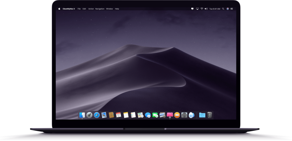
This container row has a right column bust out applied. That is why the Macbook image on the right is actually a full size image, but cut off and placed offset to the right, which makes this layout look sexy!
7500+ Icons
Pro Version comes with a vast number of icons with line and filled styles.
Full WYSIWYG
Kioken Blocks enhances Gutenberg in so many ways you will love it again.
Shape Dividers With
Parallax Backgrounds
Create advanced parallax effects for the backgrounds. Add unique shape dividers to maximize the creativity.
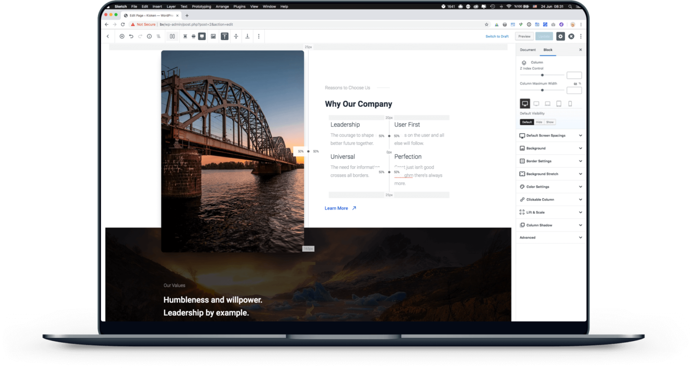
Gutenberg Container Block is so powerful and feature rich, you can create offset layouts like this one.
KiokenBlocks Author

Robust Options
Every container block and columns inside have in depth settings to fine tune your layout for every device type and size. And there are so many options you won’t ever feel bottlenecked. Get Kioken Blocks today!
Advanced Effects
Make clickable columns and apply hover transform effects on them.
Fully Responsive
Apply custom dimensions and alignment for each column, responsively.
Adjust Spacings
Each row and column can have specific margin and padding values, responsively.
Add Overlays
Apply a color, background or gradient overlay with custom opacity and parallax options.
Adjust Alignments
Align columns vertically centered, or top/bottom, or change these settings for each column.
Add Shape Dividers
Add stylish dividers to the top or bottom of the container row, or apply to both sides.
Apply Borders
Each row and column can have specific border width and custom radius values for each side.
Custom Colors
Apply custom text and link colors to be inherited by row layout content. Alpha values also available.
Full Feature List
Ready for It?
Get the most versatile and user friendly page builder utility for Gutenberg and enjoy a great editor experience like never before.